Wednesday, September 30, 2015

Two Legends

No automatic alt text available.

Blinky & Nigel. (This isn't a permanent installation, Nigel's ashes are in a portable pine box. But the Los Angeles Pet Memorial Park is our crematorium of choice, and I had a hunch Blinky might be buried there.)

Tuesday, September 29, 2015

RIP Nige

No automatic alt text available.

It is with great sadness that I announce the passing of Sporting Field's Nigel NW1 RN from congestive heart failure Monday morning. Nigel was 11 years old and had been with us since the age of 2.

A fancy show whippet imported to LA from Virginia, Nigel grew an inch over the breed standard, and joined our family during retired racing greyhounds Albert and Reyna's final stretch. After a year as a solo artist, he was joined by whippet puppy siblings Chloe and Portfolio, who were technically his aunt and uncle.

Nigel went on to be one of the first dogs trained in the sport of K9 Nosework, and the first whippet to earn his NW1 title. Just two years ago he completed his Rally Novice title at the Whippet National in Eugene, OR, with the second highest score (after Portfolio, of course!)

Nigel was full of humor, curiosity, and boundless good cheer, even during the last year as his heart grew to bursting. He was my guru, and I'll be hard pressed to find as good a role model. We'll all miss him.

Saturday, September 19, 2015

Friday, September 18, 2015

Cathy Ward at The Good Luck Gallery


Cathy Ward and Eric Wright have headed back to the UK, but Cathy’s solo US debut is up through Oct 3rd at The Good Luck gallery in L.A,’s Chinatown. I've written about Cathy's extraordinary scratchboard drawings a couple of times (here and here), but never had the chance to see more than a couple at a time in person until her current show. My first impression was that I was in some kind of Victorian era Jules Verne bathysphere (or bathyscube I guess) studded with portholes, each one looking out on a different murky, mysterious parallel reality -- all of which seemed to be made out of hair.


On further inspection, it became clear that Cathy's work has expanded its territory considerably (this particular strain -- a bigger picture of her multiple oeuvres can be explored here and here and here). The most remarkable examples of this new direction was a trio of works grouped together at the center of the gallery's north wall. Collectively entitled Insoluble Conflicts, these works incorporate washes of sumi ink that are explored and refined with scratchboard-type incisions. 


The new painterly quality conjures the badass Anglo romantic tradition of William Blake and JMW Turner, while the aleatory compositional technique -- wherein Cathy teases out hallucinatory imagery from cloudy washes -- and the informational density of the results trigger associations with German artists Albrecht Durer and Max Ernst (particularly the one with the Loplopesque bird), all of which is in keeping with the artist's fascination with Euro-paganism. I'm not sure how Da Vinci's Deluge drawings fit in, but it probably has something to do with the Freemasons.

Cathy Ward's work has been selected for inclusion in Pulse Miami in December, so her prices are certain to escalate. Snap 'em up now!


'patacritical Interrogation of Helle Haasse

re: The Limbourg Brothers & "the absolutely to come fall"!


Monday, August 24, 2015

Happening's Masses


Three recently completed recordings of new lo-fi, droney ambient choral works -- Happening's Masses for 2, 4, and 6 Voices -- are now available for free DL or streaming at archive.org

Friday, August 21, 2015

Sunday, August 16, 2015

Industrial Battle Ax


...tucked next to the cash register at Agoura Boxing Gym -- just in case! Includes inadvertent self-portrait.

Tuesday, August 4, 2015

RIP Hobobot

Image may contain: sky, tree, plant and outdoor

Oh no! Now they've killed Hitchbot's brother, Hobobot, while he was trying to hop a freight! When will the violence stop?

Monday, June 8, 2015

A Sacrilegious Glimpse of LA's Mid-Century Modernist Cognoscenti

Even though my film [Fragment of Seeking 1946] had aroused no interest at USC, one day Kenneth Anger informed me that we were both invited to show our films at a private gathering of fellow artists and intellectuals at the Schindler House in Beverly Hills....
Mrs Schindler ignored the films and spent her time during their projection preparing her tea table. Hence, she had no idea why her emergence from the kitchen after the showing was met with a stunned and stony silence. Everyone in the room was too shocked to say a word. Kenneth and I were kept waiting in the anteroom while we wondered what had happened....
After a very long time, John Cage was delegated to speak to us. He took us out into the garden where we could be alone. "You must understand that these films are not art," he said. "Art has to do with clouds and trees and beautiful things." He repeated, "These films are not art."
...Nearly no one else present would speak to us, so we took our projector and films and went home. A few days later, Mrs. Schindler called Kenneth and told him coldly, "We just want you to know that we have discussed your films and have decided that you are two very sick boys." A few months later, Kenneth embarked for Paris....
Curtis Harrington
Nice Guys Don't Work in Hollywood

Sunday, May 10, 2015

RIP CB

Image may contain: one or more people and outdoor

Tee-shirt design 1987. Clockwise: Fountain, Marcel Duchamp, 1917; Leap into the Void, Yves Klein,1960; Through The Night Softly, Chris Burden,1973; Benjamin Peret Insulting a Priest in the Street, 1926. RIP CB.

Wednesday, May 6, 2015

The Future of Painting is Chained to Nancy Sinatra Times Five!

No automatic alt text available.

My piece in DIRT - "Movin' On I - V" spray enamel and atmospheric detritus on canvas with plastic chains and motion-activated robotic musical gogo boots (2015) http://www.jancargallery.com/show.php?num=268


Monday, April 27, 2015

Saturday, April 25, 2015

Chemistry Set Cutie!

No automatic alt text available.

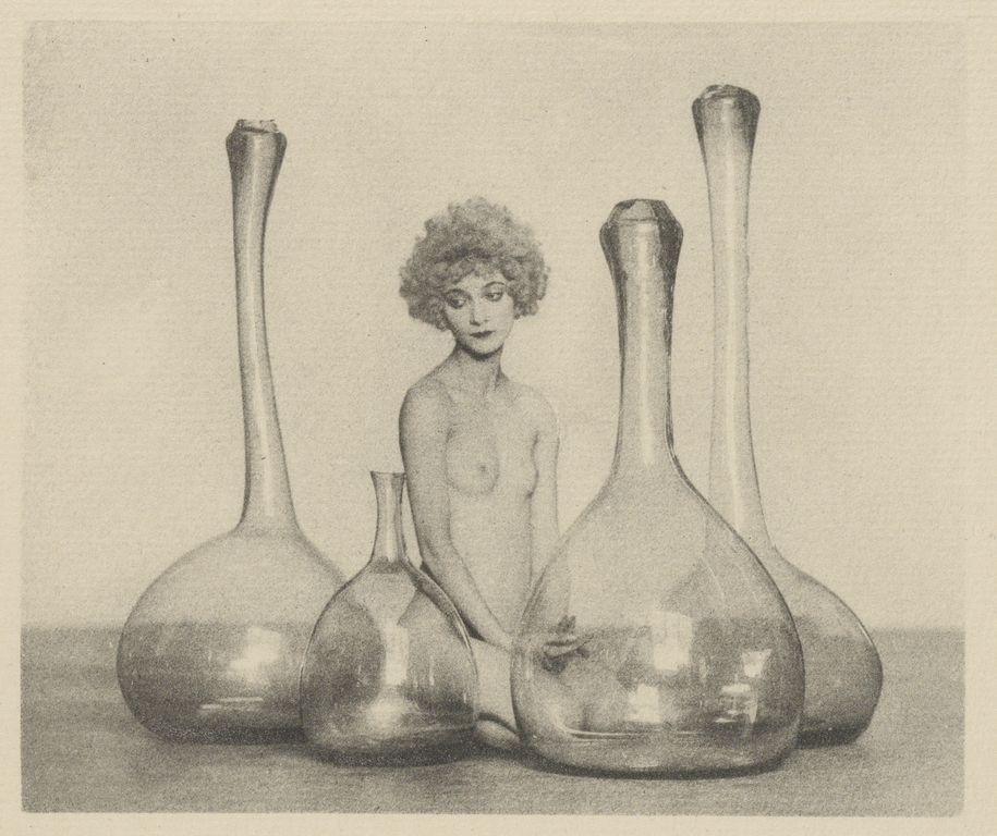
Just found this weird photographic print, some kind of lab-glass flapper erotica printed on stationery, so probably a litho(?) - tucked in between the leaves of a 1925 collection of panel cartoons by Ellison Hoover. I googled the signature "A.F. Kales" and I guess he was a Hollywood still photographer from that period...

UPDATES:

Nic Waterman found out a bit from an article on 20s exotica. [Famous Hollywood Pictorialist photographer] William Mortensen was a pupil of Kales. Nic adds: "This image was in a 1928 exhibition at the Smithsonian, so I think it was considered fine art."

from http://historicalzg.piwigo.com/index?%2Fcategory%2F132-west_coast_kales_mortensen_weston_and_mather_vlad

Arthur F. Kales
Time Period: 1910s-1936
Location: California

“Arthur Kales (1882-1936), a prolific American pictorialist photographer during the 1920s. Pictorialist photographers believed that photographs should emulate the formal elements of etchings or paintings. Pictorialists renounced the sharp accuracy of a photographic image, thus the film was subdued by soft focus and other photographic techniques. The photographers often planned the picture's scenarios, much like a painter composes a painting. Arthur Kales joined this movement while he was in his late 20s. Born in Arizona in 1882, Arthur Kales moved to California in 1903 where he remained for the rest of his life. Initially pursuing a law degree, Kales found photography instead. By 1918, Kales was deeply committed to the popular Los Angeles pictorialist movement. By 1922 he was a regular essayist for the journal, Photogram of the Year. In 1928, Kales was awarded a fellowship from the United Kingdom's Royal Photographic Society and was given a fifty-print retrospective by the Smithsonian Institution in Washington D.C. Despite his vast repertoire of subject, matter, his work can be identified by his ethereal yet exquisitely intricate compositions."

Tom Christie found this [Female Nude with Bottles] on page 12 of the Getty's collection of Kales:

No description of this image is available.

Model is silent film actress Marguerite de la Motte, circa 1920. From Wikipedia: 

Marguerite De La Motte (June 22, 1902 – March 10, 1950) was an American film actress, most notably of the silent film era. Born in Duluth, Minnesota, De La Motte was the daughter of Mr. and Mrs. Joseph De La Motte. She was a 1917 graduate of the Egan School of drama, music, and dancing.

De La Motte began her entertainment career studying ballet under Anna Pavlova. In 1919, she became the dance star of Sid Grauman on the stage of his theater. In 1918, at the age of 16, she made her screen debut in the Douglas Fairbanks, Sr directed romantic comedy film Arizona. In 1920, both of her parents died, her mother in January in an automobile accident and her father in August from heart disease. Film producer J.L. Frothingham assumed guardianship of her and her younger brother.

De La Motte in 1921.

De La Motte spent the 1920s appearing in numerous films, often cast by Douglas Fairbanks, Sr. to play opposite him in swashbuckling adventure films such as 1920's The Mark of Zorro and The Three Musketeers. She developed a close friendship with Fairbanks and his wife, actress Mary Pickford. Her career as an actress slowed dramatically at the end of the silent film era of the 1920s. She did continue acting in bit parts through the sound era and made her final appearance in the 1942 film Overland Mail opposite both Noah Beery, Sr. and Noah Beery, Jr., as well as Lon Chaney, Jr.

De La Motte was married twice. She first wed silent film actor John Bowers in 1924, who was then a matinee idol of the silver screen. The couple were separated at the time when Bowers committed suicide in 1936. De La Motte later married attorney Sidney H. Rivkin whom she later divorced after four years of marriage. Her cousin, Clete Roberts, was an American war correspondent and journalist, who appeared in two episodes of the television series M*A*S*H* in the 1970s.


After her film career ended, De La Motte worked as an inspector in a southern California war plant during World War II. Later she came to San Francisco, California, where she worked in the Red Cross office.

On March 10, 1950, De La Motte died of cerebral thrombosis in San Francisco, three months short of her 48th birthday. On February 8, 1960, De La Motte was awarded a star in the Motion Pictures section of the Hollywood Walk of Fame at 6902 Hollywood Blvd., in Hollywood, California.

Turns out it was created using the Bromoil print process, which begs the question "What the hell is the Bromoil print process?" God bless you, wikipedia!

Oil print process

The oil print process is a photographic printmaking process that dates back to the mid 19th century. Oil prints are made on paper on which a thick gelatin layer has been sensitized to light using dichromate salts. After the paper is exposed to light through a negative, the gelatin emulsion is treated in such a way that highly exposed areas take up an oil-based paint, forming the photographic image.

A significant drawback to the oil print process is that it requires the negative to be the same size as the final print because the medium isn't sensitive enough to light to make use of an enlarger. A subtype of the oil print process, the bromoil process, was developed in the early 20th century to solve this problem.

The oil print and bromoil processes create soft images reminiscent of paint or pastels but with the distinctive indexicality of a photograph. For this reason, they were popular with the Pictorialists during the first half of the twentieth century. The painterly qualities of the prints continue to appeal to artists and have recently led some contemporary art photographers to take up these processes again.

The origins of the oil print process go back to experiments by Alphonse Louis Poitevin with bichromated gelatin in the 1850s.

To make an oil print, a piece of paper is coated with a thick gelatin layer containing dichromate salts that sensitize it to light. A contact print is made by laying a negative over the paper and exposing it to light, which leads to hardening of the dichromated gelatin in proportion to the amount of light that reaches the paper. After exposure, the print is soaked in water and the non-hardened areas absorb more water than the hardened parts. The sponge-dried but still moist paper is then inked with an oil-based ink, which sticks preferentially to the hardened (drier) areas. The result is a positive image in the color of the ink. As with other forms of printmaking, the ink application requires considerable skill, and no two prints are identical.

Multicolor oil prints are possible through local inking of the print, and it is also possible to create reverse prints by contact-printing the wet oil print to a piece of plain paper. Artists have also sometimes created variations by applying extra paint using brushes. In the later 19th century, it was possible to buy commercially prepared gelatin-coated paper.

Bromoil process


The bromoil process is a variation on the oil print process that allows for enlargements. In 1907, E.J. Wall described how it should theoretically be possible to place a negative in an enlarger to produce a larger silver bromide positive, which would then be bleached, hardened, and inked following the oil print process. That same year C. Welborne Piper worked out the practical details. Much as Wall envisioned it, the bromoil process starts with a normally developed print exposed onto a silver-bromide paper that is then chemically bleached, hardened, and fixed. When the still-moist print is inked, the hardest (driest) areas take up the most ink while the wettest areas become the highlights.

An issue with the bromoil process is that inadequate rinsing of the chrome salts can lead to discoloration of the prints when exposed to light over long periods of time. In addition, irregularities in the thickness of the gelatin layer can, under unfavorable conditions, lead to stresses that damage the pictorial (ink) layer.

Wednesday, April 15, 2015

Wednesday, March 25, 2015

A Part for a (W)hole – Mike Kelley as avant-garde literature

I haven’t written anything about Mike Kelley since he killed himself just over three years ago, but it isn’t for the reasons you might think. Like most of his friends and acquaintances in Los Angeles, I have decidedly mixed feelings about his career-topping final exit, and sorting those out is an enormous, ongoing, and private undertaking. No, the primary impediment to my weighing in on Mike’s legacy is the fact that his oeuvre – now being complete – is, frankly, mentally and physically overwhelming. For a depressed guy, he sure did a lot of work!

This was literally brought home to me recently when Kelley’s Stedelijk Museum retrospective finally made it back to roost at MOCA’s cavernous Geffen Contemporary facility. But wandering from room to overstuffed room, I experienced an unexpected and paradoxical reaction. I kept feeling there was not enough. That the exhibit was incomplete. Which is crazy – I had already spent 10 hours in the former LAPD garage, and felt I had barely scratched the surface. They couldn’t include every single scrap left behind by the hardest working man in art business, could they?

Could they? It occurred to me that that was exactly what I wanted to see, physically, in one place at one time – Mike Kelley’s complete works, with no missing parts. Not only that, but I wanted it to be a permanent installation, available for repeat in-depth visits over a number of years. It’s not something I could say about many artists (certainly not Clifford Still, who managed to arrange something pretty close) and I realize that such a model is completely unfeasible in the context of contemporary culture, but… there it is.

In a day or two, I realized that my desire was bound up with an understanding of Mike’s art as One Great Work, like some great novel. Very much like some great novel -- characters, plots, motifs, satirical targets, formal devices, and linguistic tour-de-forces recur with rhythmical regularity and subtle (or drastic) variation in Kelley’s work.

Albeit in an immersive, multi-sensory, modular, non-linear structure. With Gravity’s Rainbow or Finnegans Wake I felt that I didn’t quite glean every last drop of meaning and pleasure from the first go-round. Same here. It had to sink in. And I would need to revisit it in a year -- and again in five years, and in twenty, fifty, whatever. Forever. Not gonna happen.

And yet there is an argument to be made for the holographic view – or at least that Kelley’s most deliberately written works contain the template for his larger corpus; the cornerstone of Mike Kelley’s success as an artist has always been his literary virtuosity. Contrary to common wisdom regarding text-heavy pictures, Mike’s dense early black-and-white paintings and drawings actually attract and hold the viewer’s attention. And his early performance art works stood out from the herd of endurance tests and neo-ritualistic costume dramas by the sheer strength and wit of their writing.


Tuesday, March 24, 2015

Misunderstanding Sculpture


Having somehow acquired two university degrees in Painting and spending the subsequent 20 years as a professional artist, curator, and critic, I am as sensitive as the next artworld insider to the ways in which art schools, gallery scenes, and the state of contemporary art are depicted in popular narratives. They usually get it embarrassingly wrong.

The medium of comics seem particularly susceptible, riddled as it is with whining fanboys traumatized to learn in their art school foundation year that the drafting chops that kept them from being beat up since the third grade haven’t been considered relevant since 1837. Even brilliant social satirists like Dan Clowes and Chris Ware can miss the mark by aiming at straw men patched together from sitcom stereotypes and Andy Rooney editorials. So it is with some trepidation that I approachedThe Sculptor, Scott McCloud’s first substantial foray into graphic narrative practice after decades devoted to graphic narrative theory, with his inescapable Understanding Comics and its sequels.

The Sculptor tells the story of a young flash-in-the-pan art star wannabe who had his 15 seconds and blew it, but is still hanging around Manhattan as he sinks into despair and oblivion. So far so good! But instead of crawling back to the sticks and staking out a future as an adjunct Community College instructor, our protagonist David Smith (named, oddly, for the most famous mid-20th-century modernist American sculptor) manages a Faustian bargain that will almost certainly get him the prizes he deserves. Antics ensue.

I don’t want to spoil the plot, which manages to be simultaneously formulaic and bizarre, but David is suddenly able to fabricate an enormous number of highly crafted, idiosyncratically personal cartoonish granite sculptures in a very short time. He fully expects this extravagant bounty to redeem his reputation and career, but the artworld’s (quite accurate) response is dismissive, comparing his cluttered studio to a “Polynesian gift shop” and launching him on a shame spiral that quickly leaves him disoriented, homeless, and suicidal. Enter the bipolar aspiring actress with the heart of gold, and David’s chance to learn the real meaning of Christmas. Or something.

Just shy of 500 pages, The Sculptor is an engaging, entertaining read – a surreal potboiler with the fluid, flexible, cinematic pacing you would expect from perusing the author’s theoretical treatises. McCloud’s images are also distinctly filmic, with lots of crane shots and noir expressionist compositions interspersed with too-occasional passages of contemplative observational detail. The ambitious scale and production values are inordinate to McCloud’s track record in fiction, and the effect is ultimately reminiscent of M. Night Shyamalan, whose movies always beg the question “How did this ever get made?” Which is a good thing.

Read the rest at The Comics Journal website (or ATJ)

CATHY WARD: MEMORIALS GROWN FROM CLAY AND INK


Article about the inimitable Cathy Ward in the upcoming RAW VISION - she'll be having her LA solo debut at The Good Luck Gallery http://www.thegoodluckgallery.com in the Fall.

"Impossibly intricate, nearly-abstract renderings of hair incised into scratchboard; baroque cut-paper collages sourced from porno mags; an immersive environment of carved and painted trees meticulously encrusted with Germanic kitsch; a decade-long exhaustive photodocumentation of food vans; luminous fin-de-siècle paintings for post-punk record covers; a faux-museological recreation of a neo-paganist secret society initiation chamber; a reenactment of the doomed trek of the Donner Party (minus the actual cannibalism) – unlike many artists classified as “outsider”, Catharyne Ward has passed through a succession of distinct phases more appropriate to the career of a mainstream post-studio conceptualist like Mike Kelley or Rosemarie Trockel.

Yet, despite attending the Royal College of Art in London (albeit in ceramics) and hanging with Eduardo Paolozzi, she has managed to avoid being shortlisted for the Turner Prize or gracing the cover of Artforum. So far. Such conventional accolades would not be hard to imagine, given the ambition, timeliness, cross-disciplinary panache and sheer visual beauty of the work, but Ward’s forceful idiosyncracy, authentically subversive political undertones and psychological candour – not to mention her labour-intensive craftsmanship – have kept her outsider credibility intact.

Perhaps the most well-loved works in Ward's diverse oeuvre are her scratchboard drawings of cascading, contorted masses of hair, which have been likened to the work of Madge Gill and Austin Osman Spare. The somewhat disreputable hobbyist medium – a subtractive, even sculptural, drawing practice where a black India ink surface is scraped away to reveal an underlying layer of white china clay – packs a graphic punch, while coming equipped with a whole set of symbolic connotations..."

Image: Surgenesis, 2008, china clay and India ink on board, 16 x 20 ins

Purchase to view the entire article: Raw Vision #85 or continue ATJ

Thursday, March 19, 2015

Michael Parker's JUICEWORK at Human Resources


I haven't been doing much art reviewing lately, but here's an excerpt from "Michael Parker 101," which will be included in the catalog for R.S.V.P. Los Angeles at Pomona College Museum of Art, Fall 2015 (ed. Rebecca McGrew and Terri Geis).

"The history of Modern art could be mined for precursors to relational aesthetics at least as far back as the Dada antics at the Cabaret Voltaire. But most of the current practitioners of this newest of New Genres distinguish themselves by subscribing to a conceptualist austerity of means—favoring deadpan structural and procedural documentation; emphasizing, often exclusively, the social interactions produced by their artworks; and eschewing formalist content, such as the tactile, sensual, and perceptual elements of art and the visual language they comprise.


While the relational artists’ puritanism can be helpful in focusing and clarifying their intentions (plus having the bonus effect of destabilizing their claim to creative authority), it also abdicates subjectivity, idiosyncrasy, most of the non-narrative non-verbal information (which provides a much different kind of ambiguity than crowd-sourced content), and the majority of the sensory rewards that many still consider integral to art. It is a dry medium, lacking juice. But it doesn’t have to be that way.

In his most recent solo exhibition, Michael Parker brought the juice with a vengeance. For Juicework, held at Human Resources in Los Angeles’ Chinatown district over four days in February 2015, the artist filled the cavernous white cube of the gallery—a former neighborhood movie house—with an array of interactive components that took sensual engagement to an absurd but exquisite extreme. Consisting of a dozen or so stations where visitors could produce and consume juice from the abundant supply of citrus fruits (plus a dishwashing area), the installation functioned perfectly as a locus of conviviality, with perhaps a spritz of social commentary (juice boutiques being currently synonymous with the sustainable gentry).


What made Juicework remarkable was its extravagant sensuality and homespun eccentricity. Each of the juicing stations consisted of a table fashioned from an irregular tree slab raised about 10 inches off the floor and lit by hanging porcelain pendant lamps molded from what the artist called “the ugliest watermelon of the summer.” Various sizes of coiled fabric cushions sealed in clear vinyl and an array of ersatz African stools provided seating.

But the pith of the display consisted of over 1000 handmade ceramic artifacts—mostly freeform juice reamers of various sizes, but also sufficient quantities of cups, funnels, trays, and larger vessels to hold the mounds of yellow, orange, and green fruit. The ceramic tools were mutantly variegated in shape, scale, and finish—with organic forms recalling sea anemones and sumptuous mottled glazes in the blue-violet-red end of the spectrum.


Visually, the installation was like nothing so much as an immersive stained glass Art Nouveau theme park, like walking through Antoni Gaudi’s studio during a minor earthquake. And an aromatherapy session. And experimental choreography workshop. And yes, the social aspect was delightful. But it might not have been so, without the opium-den intimacy and Haight-Ashbury facture to knock the public’s discursive minds off their “I-am-participating-in-a-social-artwork” pedestals..."


Better pictures and more info at: http://humanresourcesla.com/michael-parker-juicework/